Saturday, November 19, 2022

2000s Housing Price Drop

  We are sixteen years past the price peak of the 2000s housing bubble and people are still coming up with explanations for those outcomes while ignoring really basic and easy to find and verify facts.  Arnold Kling links to this post here which includes the statement

What makes things especially tricky for the Fed is that the housing market is much less liquid than other major assets like stocks or bonds. It takes a couple of months for someone to sell their home, and then another month or two for sales to be reflected in national statistics. As a result, home prices tend to have more momentum than other assets. Once prices start to fall, they tend to keep going in the same direction.


The use of the term momentum here is bizarre, and requires a very strange definition to allow it to be correct.  Using Case-Shiller housing prices peaked in 2006 and bottomed in 2012, but the term momentum doesn't describe the action at all.  The fall was steady at first, accelerated during the second half of the recession and then was slow with multiple upturns for the final 2 years.  


We see 3 false bottoms during the final 3 years of the decline.  The behavior after the peak is a fairly straight forward story of supply and demand:  During the run up in prices* supply was outstripping demand as to much housing was built.  The evidence here is simple- vacancy rates were rising as prices were rising


At the peak we didn't just have to much housing supply there was a pipeline of unfinished projects which were in some phase of starting but not completed that were put on hold.  As prices started to stabilize those projects were completed, boosting supply and damping down prices again.  We can see that in the starts minus completions data


Starts logically have to precede completions but from 2006 to 2011 the US was finishing hundreds of thousands of more units than it started.  This is the tail end of the overbuilding that was occurring during the mid 2000s, and the price bottoms very shortly after we have burned through that overhang in 2012 where completions are dominated by starts again.  A straightforward supply and demand rebalancing gets us most of the way to understanding the price action after the peak in 2006.  

We have no such clear market behavior right now.  The eviction moratorium and stimulus checks have skewed demand making the very low vacancy rates difficult to trust.  I can confidently say that those two things are pushing housing demand higher but the magnitude is not easy to pin down.  What ever the outcomes today they won't be driven by the same factors as occurred in 2006, and certainly not by vague assertions of 'momentum' based on how long it takes for a house to list and sell.  

*This explanation is skipping over the how of increasing prices in concert with increasing supply which is the more interesting question.


Wednesday, October 23, 2019

S&P straddle

Purchased a call for SPY 303, November 29th and a Put for SPY 293, same expiration. 

Tuesday, October 8, 2019

Habit vs incentive

Ask a generic economist about the importance of a significant down payment for the housing market and they will reply with something about homeowners needing skin in the game so they don't bail at the first sign of trouble, and/or as a protection for the lender.  This ought to have gone up in smoke during the financial crisis as many of the defaults and write downs came from homes with large down payments and well documented incomes.  The primary tool of the large down payment is as a selection mechanism, and the slashing away at that mechanism was a major factor in the run up in prices. 

The basic principle is simple, if you can save a significant sum of money then you are a much better risk for a loan than someone who doesn't. Home ownership via a mortgage comes with a double whammy, first you have structured regular payments for the mortgage, insurance and property taxes, then you have lump sum costs for repairs.  A new roof, leaky pipes, broken windows, some large some small but persistent and sometimes lumpy.  In short once you buy the house and commit to the recurring costs and dump your savings into the down payment you need to start saving again to handle these costs.  This is where habit comes in, who is more likely to be able to maintain the house (ie the collateral), the one who saved 20% of the purchase price or the one who didn't?  The answer is obvious.

Rising home prices didn't break the truism, but it did muddy the waters a lot.  Having a 20% down payment could still have been due to a high savings rate, but it also could have been due to luck.  If you bought a $100,000 house with 20% down early in the 2000s and home prices pushed its 'value' up 50% over the next few years then you could sell your house and have ~$70,000 available for your next down payment which would qualify you for a $350,000 loan (obviously your income might not) on the next one.  Or you might have borrowed against that 50k in new equity and purchased a second house as a rental/vacation home/speculative asset.  This is a very different situation than a person who bought a house, and then over several years saved up another down payment worth of cash.  In both cases there is an incentive to keep the 2nd house with the down payment, but in one case you have a buyer who clearly was living below their means for several years and another case where it is unclear if they were or weren't. 

During the financial crisis one of the largest segments for defaults was second homes purchased with normal down payments, which I believe was largely caused by the rise in home prices distorting the signal that a down payment usually brings. 

Monday, September 23, 2019

Liquidity something

The big news from this past week was the Federal Reserve's sudden re-entrance into the overnight repo market, and adding liquidity.  First question is was this a demand spike or a shortfall of supply?


No real demand spike, but a persistent decline in excess reserves has been decreasing the available supply.


 Supply is also short in another sense


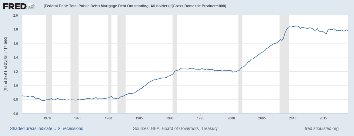
It seems unlikely that there is no maximum level of debt for a country, be it government, private or combined.  Obviously it would be shifting based on factors such as interest rates but conceptually it is hard to argue that debt to gdp ratios can go up indefinitely, and it is likely an empirical answer you will get. 


So here we are, a major financial crisis that started with massive debt levels and 10 years later those levels are roughly the same.  We have now a strong policy of government stimulus in the face of recessions, with 2008 starting with a little remembered 110 billion dollar stimulus before a recession was officially recognized which came 7 months after the Fed started an easing cycle.  Who is going to get hit this time if debt is increased?


To maintain the current level of total debt there will have to be a reduction to offset any government stimulus.  The price rise you see above should be viewed even more skeptically than the one up until 2007 because it is on lower volume.  Below is existing home sales (had to change sources)

United States Existing Home Sales

Plus new home sales


We are looking at significantly lower volume, significantly less dollar value to gdp for mortgages in a larger country (in real prices the peak isn't as high as the previous peak though).


If this next recession is significant, with significant additional government debt I would expect home sales volume to die, and when volume dies volatility explodes. 

Thursday, August 29, 2019

Closed all shorts

Closed all shorts at significant losses.  Currently anticipating markets to rise for next 6 months, considering going long. 

Monday, August 5, 2019

perspective

Some people describe the housing bubble of the early 2000s as being isolated to a few major cities, their outsized effect being what drove the events that unfolded.  Smaller cities, such as Cleveland Ohio, had much smaller run ups, and smaller busts.  As usual this is a matter of perspective.


The two series diverge in 2000, with the national series running up 85% to the Cleveland series 23%, the declines are actually reasonably close though with the national rate dropping by ~ 27% peak to trough and the Cleveland series dropping ~22%.  From that perspective the national average had a larger run up and decline, however from another perspective Cleveland lost all of its post 2000 gains with its index dropping back to 1999 levels, while the national average pushed back to only around 2003.  The rebound has also been dramatically in the National averages favor with the 2006 peak being matched in 2016 and a steady rise after that while Cleveland only recently matched its 2006 peak.

The other perspective is then that without the housing bubble Cleveland's home prices would have been flat or falling while the national average would have been rising, albeit more slowly and that the impact on Cleveland was larger because the difference between a rising and falling market is much greater than the difference between a rising market and a market that rises at a higher rate.

*****************

I like thinking about different ways you can explain the yield curve, one way is to use the Cleveland perspective.  That is the difference between getting a 30 year bond at X rate or a 20 year bond at a slightly higher rate is small compared to getting out of equities during a rise and getting out of equities during a fall.  If you are jumping out of the way of a steamroller it doesn't matter much if you jump into a bramble patch, even though that bramble patch is far inferior to a manicured lawn because 99.9% of your desire is simply not getting crushed.


Monday, April 29, 2019

Short UNH

Puts bought on UNH again, still feel good about my general thesis and am just trying to pick good times to go short. 

Thursday, April 18, 2019

Wednesday, April 17, 2019

Closed UNH, 3/4ths of HQY

Closed out my first position posted here, put on UNH up ~280%, and UNH up ~105%, and a position I took this morning which was a put on abmd.

Selling here because I find myself frozen, unable to think of what to do next.  This is an unhealthy mindset that I am familiar with from playing poker years ago, better to step back, collect thoughts and then proceed.  Buying a put on abmd worked out, but I bought because I didn't want to watch a big move down right after I sold out of half my exposure, basically it was emotional and shortsighted, which probably will lead to other similarly based decisions. 

To state/restate my investing theory in bullet form.

1.  The yield curve inversion is an inflection point.  Approaching the inversion is a different investing environment than the period during the reversion and widening of the curve, companies and industries that do well in one probably won't do as well in the other.

2.  The curve takes a long time to narrow, long enough for the 1st effect to have knock off effects on the economy.  If housing booms from the environment then eventually construction firms will boom and then logging, reits, and realtors etc will boom.  The early stages of the boom are when the first sectors take off, the height of the boom is when all the sectors are growing and the early stage of the bust is when the leading sectors have lost their growth but it has not yet hit the secondary sectors. 

Clearly I picked the health care industry (as in stock prices within) as benefiting from the previous circumstances and the movement of prices recently has been a point in favor of my hypothesis.  Now I need to move forward on projecting the timing and depth of the pullbacks and also anticipating the first order knock off effects, not staring at prices willing them to go down further. 


Friday, March 22, 2019

Another position

Short HQY (financial/healthcare stock).  Big move down today with the curve inversion steepening along with UNH having a moderate down day.  I put a tiny position in on this a few weeks ago, this one is larger. 

Monday, February 4, 2019

Why Healthcare

Previously I discussed why I think bubbles occur in the US but I left out why I took the position I did, and I was asked so the answer is:

I asked the market.  Starting from the assumptions that I layed out the conclusion is fairly straightforward.  The bubble sector* would be one that has grown much faster than the surrounding economy and then showed strong signs of a peak just as the yield curve started to invert.  There were a few other check marks that it would need to have, such as increased demand or government meddling recently to explain why they were the sector that the money flowed into, but those were obvious for healthcare once I found that the other two patterns fit. 

As for individual companies I went through and chose one whose growth appeared to have benefited the most from this situation (stock price wise). 

*There doesn't have to be just one.


Monday, January 28, 2019

First Move

I posted my first trade based on the ideas that I have been (slowly outlining above), I am listing my general positions here (but not the specifics) for tracking purposes (yours and mine).  Today I went short (via puts) on United Health Groups stock (UNH ticker).  This is not financial advice, this is simply my position and my reasoning.  My actual advice is don't take financial advice from random people on the internet.  A little bit of my positional reasoning to follow.

My current thoughts on how bubbles are created in the US is functionally a Cantillon feedback loop (for lack of a better term).  As the Fed expands the money supply in the aftermath of a recession there will be some sector of the economy that is situated to benefit from this more than the others.  One possible reason for why an industry would have greater profit potential would be a recent shifting of regulations meaning there is a new profit space to be explored and the means to do it.  Three factors then compliment each other to push up the desirability of investing in the sector.  First is the higher profit potential, the second is that there are underused resources in the economy as it comes out of recession, and third you have the Cantillon effects.  Money naturally flows faster towards areas where there is more profit potential and so any new money* that enters the system is more beneficial to these sectors than other ones, and the sector gets first crack at the unused resources.

This gives you the initial growth period, but it also allows you to overshoot the "natural" total growth that an industry would see.  Each new dollar that is created disproportionately benefits the particular sector and so the sector has an outside boost for as long as the Fed is loosening.  From my point of view the Fed is functionally loosening until the Yield Curve starts to invert.  The curve inversion strongly coincides with the early signs of issues within the bubble.  The 2006 inversion was just before the sudden decline in new housing starts and the 2000 inversion was just before the sudden decline in the NASDAQ.

This general explanation has two advantages over other discussions of the Yield Curve that I have seen.  It can be used to explain why the recession typically starts 6-8 quarters after the inversion and it can explain why the bubble does not reflate when rates are cut.  The latter point is often ignored, as the Fed was cutting interest rates in July of 2007 and in November of 2000, both ahead of the beginning of the recession.  


*using the term loosely here


Monday, December 3, 2018

More on debt

In my previous posts I have frequently discussed government debt and the dangers it causes, but with fairly vague notions of where it becomes dangerous.  Looking further into this I have sketched out a basic outline for myself, and it follows.

1.  To steal from Adam Smith, there is an awful lot of ruin in a nation.   A country can absorb a tremendous amount of debt and spending without a collapse, and even in some cases with continued growth.  Greece hit 100% debt to gdp levels in 1994, but didn't have (perhaps thanks to some fraud) major issues until the world started shaking in 2008, and I discussed Japan as an example in my most recent post.   This is not to say that these countries were trouble free, only that the high debt loads looked more like a hindrance than a potentially fatal flaw.

2.  High debt levels can exist for long periods of time, and so are "slow moving" crisis in that sense, but the end is very fast.  The indicators that a country is approaching a crisis appear to likewise be slow moving for long stretches.

One rule of thumb that looks solid is a lack of improvement in debt to gdp levels during good times.  Greece had decent growth from 1994 through 2008, but debt to GDP levels stuck at between 98% and 110% of GDP during that time.  Think of it this way, if you left college with $50,000 in unsecured debt and started out making $50,000 a year and 10 years later you were making $100,000 a year but your unsecured (ie no mortgages) debt had also increased to $100,000 that would be a pretty bad sign for your finances, right?  What are the odds you are going to on net be paying down debt in the future if you can't even maintain a level of debt while doubling your income?  What are the odds you would be able to handle a major life crisis if your baseline is increasing debt?  Japan also had some significant warning signs during the 80s.  Their debt to GDP levels rose from 50% in 1980 to 70% in 1992 despite GDP tripling in that time.  

This is very worrying for the near future as the US has been following this pattern.  Debt to GDP was fairly stable at around 60% for the 90s and 2000s until 2008, during a period of relatively strong growth and then saw a large burst during and immediately following the crisis.  While the expansion has slowed it has not reversed with a return to full employment, debt to GDP was higher in 2017 than any year prior to 2016.  

This is a pattern not isolated to the US, I looked at 19 countries (why not 20?  because that would have been more) including most of the top 20 world economies in terms of GDP and 16 of the 19 had increased their debt to GDP levels from 2008 to 2017 and 14 of them from 2012 to 2017.  10 countries had increased debt by 20 percent of GDP or more and 5 by 30 percent or more since 2008.

This is also not a series of small economies along with the US, 6 countries from that sample now have debt to GDP ratios of 85% or more and they are the UK, Canada, France, the US, Italy and Japan.  

Saturday, December 1, 2018

Concepts From Japan

Government debt to GDP is a tricky subject to discuss these days, largely because Japan with its extreme, and growing, debt loads kind of broke a lot of people's (including mine) intuitions about debt.  The lunatic fringe of economics (MMT) likes to nod toward Japan as an example of how debt doesn't matter as long as you can print your own currency, but they don't want to nod to much as it brings up the obvious questions about their growth and how, just perhaps, avoiding collapse isn't a good enough metric on its own.  Monetarists were really excited about Japan for about a quarter or two when they promised really hard to raise inflation, and managed to do it (with a large tax increase) for brief period, and Keynesians had to repeat the adage of "they didn't stimulate enough" so many times even they appear tired of it. 

Japan is a great example of one major impact of high debt loads, you get boxed in on one path, or boxed out of others.  The old debt concept that since a government liability is someone else's asset they must cancel out only works on the balance sheet.  With a debt to GDP ratio of 250% these days and government spending at around 40% of GDP interest rates of 16% would engulf the entire budget.  This is an extreme and ultimately meaningless example in a lot of ways, interest rates are no where near 16%, Japan doesn't roll over its bonds annually, etc.  The idea is not to note THE point where their government would 100% go bankrupt, but to note how much lower the point is now than it was 10, 20 and 25 years ago.  In 2008 debt to GDP was around 190%, and a (potential) budget of 40% of GDP meant that Japan could not pay more than a 21% interest rate, and in 1996/97 when it was 100% it was a 40% rate, and their pre debt explosion levels it would have been between 55 and 60%. 

In less than 30 years Japan has gone from definite ruin at levels rarely seen (only under hyperinflation) only under to levels seen in the 1970s into the early 1980s in many countries.   It is of course unlikely that they would stave off ruin until these levels were hit, interest rates of even 5 percent now across all of their debt would be very difficult to handle and would mean effectively shifting about 10% of GDP worth of spending away from current programs to interest payments, which would have a lot of impact across the economy. 

So does high debt cause low growth or does low growth cause the high debt?  The obvious answer is yes.  Both occur.  Once high debt is in place it is very difficult to get high growth, even if you have long dated bonds where the government will have years of cushion to reduce debt levels before the payments become a problem the bondholders will be taking real losses.  If those bonds are held by citizens and corporations then those losses should be a real drag on the economy.  If interest rates tracked growth perfectly (they don't, but its a starting point) then debt levels 100% of GDP would mean functionally all increases in growth would be offset by decreases in wealth held by the public.  The reverse, perversely, might be true as well.  Declining growth would mean declining interest rates, which would push the value of debt up as long as it wasn't perceived to increase the likelihood of default. 

Why do I say perversely above?  Aren't these stabilizing forces?  I don't think that they are, I see them as channeling forces, as the economy can't handle anything outside the norm well, be it growth or contraction, and so the potential pathway of the economy narrows effectively removing the dynamic segments of the markets. 

Some countries have managed to reduce large debt loads while breaking out of a potential channel, the US after WW2 is one good example, but if you look at what it took overall it is daunting.  Federal spending was slashed by 40% in year 1 after the war, then another 40% in year 2 and another 10% in year 3, the economy was effectively heavily liberalized as inhibiting regulations (price controls and the like) were removed and perpetual destruction of capital in the form of war losses were cut out, and the Federal Reserve did its bit to, keeping rates low for years after the war (and possibly causing the stagflation of the 70s along the way... possibly).

Greece is a good (as in terrible) example of how badly this type of channeling can go, the government got to a point where outside funding was necessary very early on which allowed the scenario where those outside forces could dictate Greek policy.  Now the Greeks weren't doing a bang up job managing themselves but this functionally cut out some of the possible routes out of the crisis.  A dedicated public servant pitching a plan to restore economic growth had a double hurdle to overcome, convincing both the public of his plan and external lenders.  There is a general truism here, the fewer options you have the more likely that all of them are going to be bad. 

Thursday, November 29, 2018

Slow growth

Several accounts off the Great Recession talk about higher demand for money being a driving force, I don't see it.  I see it as reactionary to another force.


Sure you can make a case that the recession drove up the demand for more savings, but coincidence doesn't work so well when there are potential causal factors shifting a quarter or two prior.


In my previous post I noted that sales declined first, with layoffs not starting at unusual rates until late 2008, with the implication being that the rise in UE rate in late 2007 through mid 2008 was primarily caused by a lack of new job creation, not layoffs.   

The Federal debt ramp up has been stunning and barely commented on for its magnitude, it has risen by a larger share of GDP in the years after the end of the recession that it did during the recession.  We have not seen a sustained decline since the end of the 1990s, and there is only one sustained decline in Federal debt as a share of gdp sine 1980, making 33 of the past 38 years either flat or increasing debt to GDP.  The most worrying is the past decade plus now where the deficit has exceeded GDP growth every single year.  This is a large phase shift from the post WW2 economy where such years were rare, occurring only 3 times from 1948 through 1970, with each one being only a small net deficit.  

This is obviously something that cannot continue indefinitely (although Japan shows that it can continue for long stretches), but more worrying is that the typical path out of high debt levels has been robust growth and that is less and less possible.  I don't just mean because we appear to be in a low growth era, but that with debt levels this high more growth, which ought to lead to higher interest rates, will mean more debt payments.  Debt levels of over 100% of GDP make it very difficult to grow out of debt when starting with an annual deficit, and when you are starting with a budget deficit during growth years?  Yikes.

One might argue that a government can borrow long, locking in interest rates, and then absorb growth because it wouldn't increase its deficit.  This is true on one side of the ledger only, as it would only be transferring losses to the holders of that debt.  To make it work you need to have those losses not end up as a drag, preventing the very growth that you need to get the debt/GDP ratio back under control.

*************************

I don't have a good segue here, so I will just plow on ahead.  There is an idea in economics called monetary offset, basically it is that the impact of fiscal decisions (ie spending decisions made in Washington DC) can't be determined without looking at what the Federal Reserve does in response.  A fiscal 'stimulus' program that expands the deficit would only be expansionary if the Fed doesn't tighten in response.  The failure of this mode of thinking is the assumption that there is a bright line between Federal spending actions and Federal Reserve actions, there doesn't truly appear to be.  One example:  If the composition of Federal spending has an impact on the economy, that spending $100 billion on defense is different from $100 billion in tax cuts which is different from $100 billion in Medicare expansion  which is different from $100 billion in interest payments, then Federal Reserve policy that effects the interest payments of a government is functionally fiscal policy.  A shift in interest costs would shift money either away from or toward other programs which would have a different 'multiplier'.  Most Keynesian models assume that there are at least some differences, with different multipliers for tax cuts vs spending increases during a recession, and most argue that 'productive' uses of money will have higher multipliers than non productive ones (Keynes himself made that argument as well).  On the flip side of this the Federal Reserve has a dual mandate to manage inflation and unemployment, and therefore any Federal spending that impacts either of these two will in fact be influencing monetary policy.

Monetary offset relies on the idea that the Fed moves last, and that after noticing the fiscal actions they will 'correct' the economic course.  It also implicitly relies on the Phillips Curve being real, or that 'stimulus' attempts can't cause UE (which are similar ideas).  If those don't hold then the Fed doesn't have the power to offset in all situations, it only has the power to choose a path and take a bad outcome either way.

I can't help but noting here that the largest recession in my lifetime came in concordance with the Federal Government and the Federal Reserve acting in combination early on (and even prior to) what was at the time a relatively mild recession.  Lost to the collective memory hole is the fact that the Federal Government passed a 100 billion dollar+ stimulus package in early 2008, before the recession was even officially a recession.  The Federal Reserve was even faster on the stimulus train having started interest rate cuts in July of 2007, going from a FFR of 5.25% then to 2% in August 2008.  

Wednesday, November 21, 2018

Cause of Unemployment

What were the causes of high UE during the Great Recession?  Well, it isn't getting fired.


The red line here is layoffs times 4 to rescale and make it clear that total unemployment increases first and then layoffs follow.  Here it is again with the UE rate instead of total unemployed.


Layoffs are a normal part of a healthy economy, some people are bad fits for their jobs, some jobs are bad fits for the economy or company and some companies are badly run, shifting people into more productive roles is crucial for economic growth.  Layoffs during the great recession lagged, they took longer to move out of their prior range than most other indicators.  You might think that such a relationship was obvious (employers aren't prescient and generally don't like to fire people in general) but most theories off the GR require the opposite, and so the opposite is believed.  For example 

The economy surely saw what was, fundamentally, just a reshuffling of financial players and asset ownership as a sure sign (a very bright sunspot, if you will) that bad times were here again. The reaction was shift. Employers laid off their workers in droves to lower their payrolls before their customers stopped arriving. This was the worst of the many types of multiple equilibria associated with the GR.  


New home sales had been falling for 3 years before layoffs spiked and auto sales had been falling for a year+.  Other sectors differed, restaurants saw an end to a long growth in terms of total receipts in late 2007/early 2008.  They did see a decline after September 2008, but the break from trend occurred well before that.

All retail sales minus food service saw a break from trend prior to 2008, and saw early declines before the masses of layoffs in late 2008.


Monday, October 22, 2018

"Real" Interest Rates


We are diving right into this one, no words to start, just a graph! 

Red line = Federal Funds rate, blue line = Federal funds rate minus 5 year expected inflation.

From July 2003 to June 2004 the Effective Funds rate is essentially flat at 1%, during this time inflation expectations increase by about 1 percentage point.  This represents roughly a 67% increase in the expected inflation rate, from around 1.5% to 2.5%.


What is the Fed to do?  Well, start raising rates of course.  The Fed raises rates over 4 percentage points from June 2004 to July 2006 while 5 year inflation expectations move up another 15-20% to their peak at just under 3% in early 2005.  Meanwhile at the 10 year break even rate


So 10 year inflation expectations peaks right before the Fed starts raising the funds rate, and then is in the 2.2 to 2.8 range right up until August 2008 (not shown here).  Another look


The spreads here are small, but functionally doubled.  Early in the graph 10 year inflation expectations are basically 0.35% per year more than 5 year at the widest points, given that 10 year inflation includes the next 5 years as well this implies that years 6-10 should have around 0.70% higher inflation than years 1-5.  That isn't a huge deal but it is notable when rates are in the 1.5-2% range.

What is a huge deal is that the Federal Reserve raise interest rates by 4 percentage points and inflation expectations are virtually identical after the last increase to what they were at the first increase and were slightly higher for good portions of the rate increases.

If you are of the opinion that the Federal Reserve can control inflation (expectations) with the funds rate then you are looking at a 400% increase over 2 years to stop inflation expectations from rising.  And don't give me "long and variable lags", these rates include the 10 year break even rate which stops rising BEFORE the 5 year rate does.

There is a sentiment to be found that the Fed was to tight during this period, that they either raised rates to far or held them up there for to long.  This is awkward to argue as the lower of the 5 and 10 year break even rates stays above 2.15% and they were both right around 2.35% when the Fed starts easing in 2007.  Then the Fed lowers rates by 3+ percentage points from July 2007 to May 2008 and inflation expectations stay in the range the Fed wants them to.

All of this is just a set up for


This is about as close to a smoking gun as you can have against monetarism or Keynesian economics, both of which rely on using real interest rates as a mechanism for driving down the savings rate and driving up the consumption rate to combat a recession.  First I will zoom out as far as the Fed data goes to show how poorly correlated real interest rates are with the savings rate


Now a zoomed in section from the financial crisis


The savings rate fell and held steady while real interest rates climbed.  There are multiple measures here of what a "real" interest rate should be, the 10 year bond rate minus 10 year expected inflation, the same for 5 and 5, 2 year bond minus 5 year inflation, 2 year treasury minus the current inflation rate, the federal funds rate minus 5 year inflation and they all show the same pattern.  Real interest rates climbed and the savings rate ignored them, then rates fell and the savings rate ignore them and then the early stages of the financial crisis started and the savings rate moved higher and quickly.  I'm not going to discuss the spikes here, just the trend, the savings rate went from around 4% in the early stages of the recession to above 5% in about 6 months and up to the 6-7% range with peaks above 7.5%. 

If you read my previous posts on the yield curve you would note that the stock markets started rising more rapidly right around the same time that real interest rates started rising during the above period, and not long before housing starts fell off a cliff.

I am going to return to my explanation of a bifurcated market, that there exists two (or several) different sets of participants with little cross venturing.  Low, and especially negative, real interest rates should benefit borrowers at a cost to lenders.  Higher rates should benefit lenders at a cost to borrowers, and lower rates vice versa but how many would be borrowers can benefit by switching to being lenders?  If you have a cash reserve and are thinking of borrowing because real rates are low then your cash reserves are going to suffer poor growth roughly equal to the gains you get by borrowing the money for a project rather than using your own.  Moving towards equilibrium is difficult in this way, which is why the channel of rising real rates encouraging savings and decreasing real rates reducing them is central to modern macro theories and why the above graphs are so devastating to them.


Monday, October 15, 2018

Yield Curve Part 2

In Part 1 I looked at the end of the Yield Curve (YC) inversion, when it is reverting back to the normal state of short term rates being lower than long term rates.  Here we are going to look at the early stages of flattening and then inversion.

To start with I don't think that there is much that is special about the curve inversion SPECIFICALLY.  Very flat curves are just as interesting (ie tricky to explain) as the actual inversion, and there is no correlation between the depth or duration of the inversion and the eventual recession.  The inversion in 2000 was much deeper than the on in 2005 and the 2001 recession was much milder than the 2007.  There aren't a lot of consistent explanations for why a flat curve with a 0.1% difference between the long and short rates is a completely different animal from a curve with a -0.1% difference (ie inversion). 


To begin with the blue line is stock market capitalization to GDP, which is not a commonly used metric.  I'm starting with it to head off one particular complaint and that is that inversions happen when the Fed raises rates and the Fed raises rates when the economy is doing well and markets should go up when the economy is doing well.  Market cap to GDP shows (to some extent) when increases in market value exceed increases in GDP.  Lets add in the Federal Funds rate


This graph is very awkward for traditional cause and effect explanations of how the Fed should work.  First the Fed raising interest rates is supposed to slow down the economy, secondly the Fed increasing interest rates on the short end should push long end rates up (this appears to be correct, only not close to a 1:1 relationship) and third increasing short rates should push down inflation.  The latter two combined should producer higher real returns for bonds (higher returns that can be locked in with lower near term inflation) which should make bonds relatively more attractive than stocks, and the first note should slow earnings for stocks. 

Basically the Fed increasing rates ought to lead to lower stock market levels not higher, but what we see is the opposite, increases in the funds rate see higher stock market valuations in both raw levels and relative to GDP terms. 


Housing starts generally are funded with short term loans when started with borrowed money.  For the last two recessions it looks like housing starts peaks and then falls (to varying degrees) when the YC inverts but it is hard to use cost of borrowing or bank spreads to explain this when the starts were increasing with a very flat curve in the late 90s and increasing with a sharp funds rate increase during the 2000s.  In the 2000s housing starts continue to increase for 18 months before declining dramatically.

You could argue that this supports the conclusion that an inverted yield curve really is a different animal than just a flat one, but I don't think this holds as a significant factor.  First new home starts in the 90s is more of a high plateau than a peak and the decline isn't steep and secondly total construction employment only dips (when adjusted for housing completions which is the better metric for discussing construction employment) modestly after growing at a good rate up to that point.

This makes it appear as if there is no notable net reduction in borrowing related to construction, and neither does it appear that banks earnings were down during this period.  BoA's earning in 2007 were higher than 2004 or any year prior to that and Wells Fargo's 2007 earnings were higher than 2005 or any year prior.  Its all so counter intuitive or simply non intuitive that you can almost forgive monetarists who believe that you need higher interest rates to create inflation. 


Saturday, October 13, 2018

The Yield Curve part 1

See if you can spot the flaw.

1.  Printing money lowers bond yields  More money chasing the same number of bonds means borrowers pay lower interest rates.

2.  Printing money raises bond yields.  More money pushes up prices of all goods, ie inflation, inflation reduces the real value of bonds pushing up rates.

How about

1.  Higher real rates of return increase savings.  Better yields mean the opportunity cost ratio of saving vs spending shifts towards saving.

2.  Higher real rates of return decrease savings.  Better yields means less money needs to be invested to hit retirement goals, leaving more for consumption.

Let's try empirically on the first count.


No obvious correlation between shifting the Fed Funds rate and inflation expectations. 


And no obvious correlation between 30 year mortgage rates.  Rather than post 10 more graphs let me just say that I see no obvious connection between inflation expectations or current inflation rates and bond rates, or changes in the monetary base or currency in circulation. 

At one point the term inflation meant "an increase in the money supply" and now it generally means "and increase in prices due to an increase in the money supply".  The only thing that this clarifies is that you can't get very far using definitions. 

**************

Going back to the yield curve, a couple of posts ago I criticized the claim that an inverted yield curve was a causal agent in creating recessions because it reduced the incentive to lend which caused a drop in lending which causes a drop in economic activity.  This doesn't make sense for a few reasons, first there isn't any evidence in 2006 of a drop in lending when the curve inverts, nor as it is narrowing.  Secondly a drop in lending should push the long term rates up preventing or at least pushing a reversion of the curve (obviously this won't happen if lending does dry up, but its a logical hole in the argument) and finally because recessions have tended to start after the curve has started reverting. 

The best correlation in terms of both timing and logical causal power for the 2007 recession is the delinquency rates for commercial and residential property. 


To preempt some arguments.

1.  "Of course delinquencies rose, people lost their jobs and couldn't make payments". 

Delinquency rates start to rise before the UR rate, and before GDP starts to fall. 

2.  "The Fed pushed up short term rates and that caused adjustable rate borrowers to not be able to afford the payments". 

The Fed raised rates from mid 2004 through mid 2006 and held them there until mid 2007 when the starting cutting.  Delinquencies start rising in 2007 so 3 years of higher rates didn't cause an increase, and the most common adjustable rate mortgages (ARMs) are 5 and 7 year lock ins, so those people wouldn't have been hit unless they took out their mortgages between 2000 and 2002.  Anyone who did so would have been a favorite to sell their house at a large profit in 2007 rather than default as prices would have risen.  Additionally long term rates only moved up about a point to a point and a half, meaning a refinance at that time or paying the higher rate shouldn't have been wildly onerous. 

Only really short term borrowing for houses, 1 or 2 year ARMs and interest only loans, should have been at risk for sudden defaults.  In other words bad lending standards.  Commercial properties are more complicated to investigate but the conclusions are roughly the same, places that couldn't make payments weren't failing to do so because of the Federal Funds rate increases.

You also have a decent correlation on the back end with the peak of commercial properties right at the end of the recession and the peak of housing coming 9 months later, and the decline in the UE rate going along with the declines in delinquency rates. 

Lets put the YC in with delinquency rates


I left the 2001 recession in to show that the rise in delinquency rates isn't a theme common to all recessions. 

We see again that delinquencies lead, but the time the Fed pushes the YC above zero in mid 2007 the delinquency rate has already hit 2.5%, a high for this chart.  This makes sense, the Fed is reactionary and isn't going to start lowering rates on a whim, it is going to wait until it sees something in the data that needs responding to. 

This is a longish and roundabout way to get to the conclusion that the YC reversion is not causal of the recession and that the Funds rate level changes are of limited importance for most recessions by this point.